
The press has been full of a new paper in BMJ Open which claims that austerity has been killing people in their thousands. The independent called it a ‘landmark study’ and UCL trumpeted its findings.
Unfortunately, this paper – in common with the earlier paper by Hiam et al. – is fatally flawed (see here for a description of problems with that paper).
Its dishonesty starts in its title – “Effects [my emphasis] of health and social care spending on mortality in England: a time trend analysis”. This explicitly lays claim to causation, which an observational study of this kind cannot do. The title alone should not have been allowed through peer review.
But it gets much worse. Here is fig 1 of the Watkins paper:
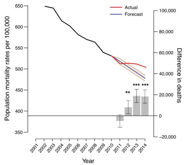
The legend reads thus:
“Figure 1 Time trend projections of age-standardised death rate (ASDR) per 100 000 individuals. ASDR (left hand y-axis) and the difference in the number of deaths between actual and predicted mortality (right hand y-axis) per year from 2001 to 2014 are shown. The black and blue lines represent actual ASDR for the 2001–2010 and 2011–2014 periods, respectively. The red line represents predicted ASDR using 2001–2010 as an observation base while the 95% CIs are denoted by the beige-coloured area. The grey bars denote the differences between the number of deaths observed and the number predicted for 2011–2014 where positive values correspond to excess deaths and negative values represent lower than expected deaths. Error bars represent 95% CIs. *p<0.05; **p<0.01; ***p<0.001.”
Notice firstly that the illustrated data are not 2001-2014 but actually 2002-2014. This may have a small effect in changing the gradient of the projected curve, but I point it out mostly because it is sloppy, which I find worrying in the core of an argument.
Note secondly, and more importantly, that the mortality rate illustrated falls from 650 per 100,000 to about 500 per 100,000* over this period. Below is a graph of directly standardised all-cause, all-age mortality per 100,000 population for England for 1995 to 2014. This is taken from data you can check in this download of official statistics:
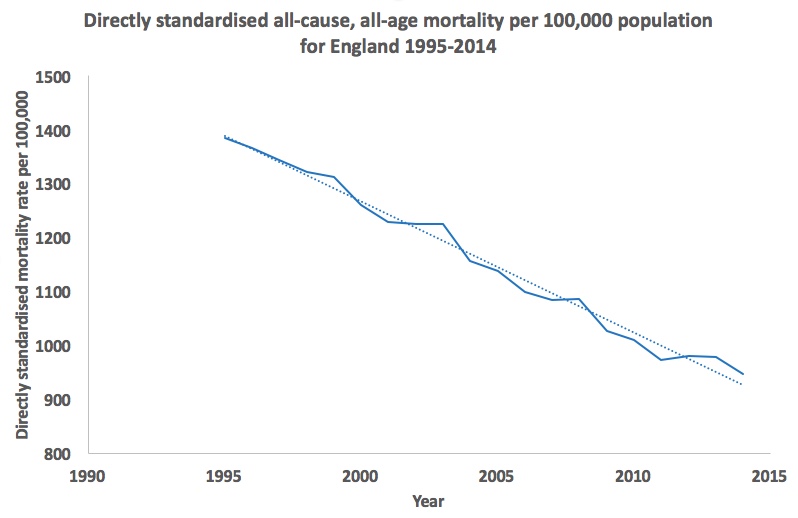
The rates for 2002 and 2014 here are, respectively, 1,225 and 947 per 100,000 population. I have no idea how these figures can be reconciled with those quoted in the paper other than to guess that the authors have got their calculations wrong. Which, in turn, throws into doubt all of the other figures in the paper.
Moreover, as can be seen in the longer timescale of my graph, the downward trend of mortality over time does not necessarily suggest a unique slowing of decline since 2010. The overall picture is plausibly one of noise around a continuing fall. One might have made as good a case for a pause in mortality in 2001-2003.
2010 itself was below the trend line, as was 2011, while 2013 and 2014 lay above it. In combination, these would largely cancel one another out. The pattern described by Watkins et al arises only by selective use of segments of the overall mortality curve.
Extension to 2015 data would illustrate a significant kick upwards – but as discussed elsewhere, that can be explained as a winter effect (itself similar to winter excesses seen at other times in the last couple of decades).
None of this means that austerity is not a huge problem for health and social care. It is. We can see that in child poverty statistics, use of food banks, stress and mental health problems relating to implementation of Universal Credit and so on. But the claim that mortality data shows an excess of deaths relating to funding cuts is unsustainable.
*Note: this figure was corrected from 530 on 21st November 2017.

OK Eugene, so how did they get it so wrong. The error in the death rates – and I’m not sure of the standardization because of the labelling of their left hand y axis – is quite astonishing. How do the authors respond?
LikeLike
Hi Phil – it looks as if the standardisation used the 1976 ESP rather than the 2013 revision – see https://wp.me/p6lccC-6g. The authors have not responded. How did they get it so wrong? I don’t know – nor do I know how such glaring errors got through peer review, or why the numbers have been so widely and uncritically accepted – but it would be good if the authors were able to address the identified problems.
LikeLike
I know some reasons why they have been so uncritically accepted! It fits with the narrative. People don’t check the original data in a paper generally. Only an expert would be able to comment on the standardisation methods. The statistics are relatively complex, the methodology dense to all but an expert. It is all getting too hard for human cognitive ability. It’s astonishing we can do it at all, so hardly surprising we get it wrong sometimes! Thanks for pointing this out.
LikeLike